Un Wire d
I just read about Wired on the Verge and I was very intrigued by its promises and description. First I visited the site and then I downloaded the application.
The website is promising: Starts by saying that the app you yet know nothing about is Beautiful . It is Pure , it is happening. It’s everywhere. It’s on.
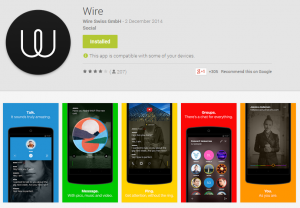
If these were the only words you read about this page then you wouldn’t understand much. Pictures don’t help either. Now to the Android market place:
Lots of color and images and content. Then I downloaded the app.
After a relatively short registration process in which you are strong-armed to verify your email you end up with these two screens. During that process there is no explanation around the application, no guide, no feature list. After that you get two bubbles explaining that you can swift right and bottom.
That’s it. No instructions, no guides, no hints. These screens have no visual cues apart from the three dots on top right which trigger a menu sinfully placed at the bottom. There is nothing simple on this design. There is a part that you inexplicably are called to colour your picture I felt like a bought a Philips Livingcolour and toyed around. It literally makes no sense, I was stunned looking at it and trying to figure out what one can do with it.
It took me 15 minutes to write this post but eventually I figured out what to do: I uninstalled it.
PS: Please make sure you hire a User Experience designer and listen to her.
UPDATE 05/12/14
I managed to make a friend on the app. Don’t ask me how, I don’t know how to replicate the experience. I am still struggling to send a message. I am amazed that this sensationally bad experience has no low. It just keeps getting worse as you move on.


