
Redesigning Reed Registration
One of the first and most important projects I worked on Reed.co.uk was Job Seeker registration. We all knew that the registration process was outdated. We knew users were having a hard time registering going through huge forms and being asked to fill in too many fields. We were experiencing drop offs. We had to do something about it and it had to be responsive too.
The process started with me talking to my lead Anna who also had more experience with the whole site overall. We went through the design thinking and also brought into light detailed analytics coming from usage and feedback coming from internal and external testing. With Mark‘s help (the product owner) we identified the key areas in the process where people started asking too many questions or even drop off the process. He also showed the direction he would like the design to take with references to existing registration experiences.
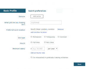
At the same time we knew we should lessen the number of fields we asked the user to fill but should also take into account the fact that those data were fed directly to our clients. There should be an equilibrium: we should ask our users the absolutely necessary data which at the same time would keep recruiters inside and outside the company happy.
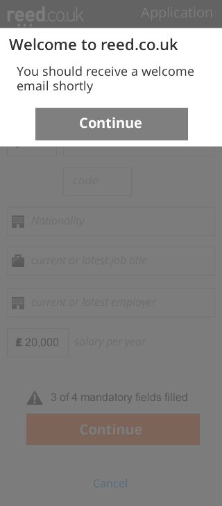
We reached a smaller number of mandatory fields. We broke the process from a single sheet into steps with confirmation. This way the user would not be faced with more than 7 fields at any point. Also added a validator on the end, not allowing form submission when there is an empty field. Especially for the mobile portrait view, we opted for completely removing the text labels on top of the fields leaving them with only the placeholder text. That really made the forms look really short and minimal.
After the first few weeks initial wireframes were communicated within the floor. We gathered initial feedback and see what the business had in mind for this project. Several versions and iterations of wireframes went back and forth between the product owner Mark and the design table, each time narrowing the frame. After almost 2 months we ended up with something that definitely seemed better than the original but there were key points that had to be worked and to which we should find solution that would also be elegant and intuitive.
At that point we should be able to test our solutions with an equal amount of prototypes. For various reasons that was not the case so we had to work around the situation with non functional visual mock-o-types. At the same time we brought into the business new tools and used fresh processes to facilitate the fact that we needed quick feedback from people outside the company without having costly large internal sessions. It is amazing how hard can become for users outside the building to test things that exist only on dev environment.
Having available multiple devices to test everything surfaced issues with the responsive behaviour straight away. Fonts and sizes did not work straight away according to plan, alignments had to be ironed. Every UI tweak had also to be registered in the Style Guide which was in development in parallel. Any change change of any kind triggered a round of testing on all devices. That’s how we reached the point of creating a prototype which we tested repeatedly to really focus on the details that could at some point become points of confusion. Copy text was rewritten from scratch four times.
Testing revealed a few amazing facts about mobile forms. As a UX designer I knew that I must provide the user with navigation and guidance on every screen. That was not the case though in our tests. Users did not care about the page title. Users did not look for breadcrumbs. They did not care how many steps were in the process. When asked, right from the start, before they filled any fields, they felt the process was going to be short. On the mobile portrait view they never felt confused with only the placeholders and a page title to help them. Their set goal of applying for a job combined with the shorter forms made them run through the forms like a breeze. A breeze that eventually swiped registrations to the top with record numbers.


